If your organization chooses to do either fixed-date release planning or fixed-scope release planning, you will want a way to communicate your team's progress throughout the release. Although any highly visible way of communicating progress is appropriate, many agile teams use some form of burndown chart and/or burnup chart as the principal information radiator of release status.
Communicating Progress on a Fixed-Scope Release in Scrum
Fixed scope releases in Scrum can communicate progress using either a burndown chart or a burnup chart.
Fixed-Scope Release Burndown Chart
A sample burndown chart for a fixed scope release is shown below. The Y axis is the number of story points remaining in the release. The X axis shows the number of sprints. At the beginning of each sprint, the team plots the estimated number of story points remaining in the release. As the sprints progress, the team draws a line between the points to reflect their actual realized velocity relative to the story points. They can also plot the predicted high velocity line and the predicted low velocity line, as well as an average velocity line. The chart shows at a glance how the release is trending.
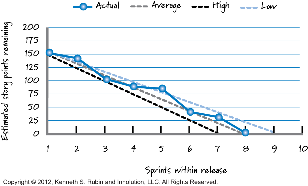 Notice that the release began with 150 points of estimated work to complete. After sprint 1, the team completed only 10 points, below even the lowest expected velocity. At the beginning of sprint 2, 140 points of work remained. At the end of sprint 2, however, the team had made up ground and was tracking closer to its highest expected velocity, with 100 points of work remaining. The team continued to plot the number of points until they had completed all of the work for the release.
Fixed-Scope Release Burnup Chart
A burnup chart shows the total amount of work in a release as a total or target line, and the progress each sprint toward achieving that goal. The horizontal and vertical dimensions of the chart are identical to those of the release burndown chart.
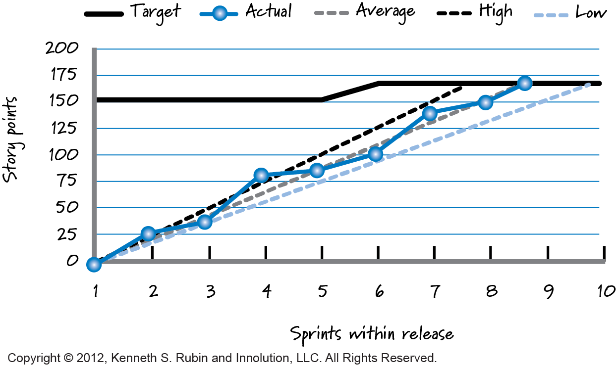
At the end of each sprint, the team plots how much work was completed during the sprint. The line formed by connecting these points after multiple sprints can be compared to the team’s predicted velocity range. The team should also plot the target amount of scope to complete for the release. It might remain the same throughout the release, or could rise or fall. The primary advantage of a burnup chart over a burndown chart is that changes to scope are evident by a change in the scope target line, as shown in the image above.
“The primary advantage of a burnup chart over a burndown chart is that changes to scope are evident by a change in the scope target line.”
Communicating Progress on a Fixed-Date Release in Scrum
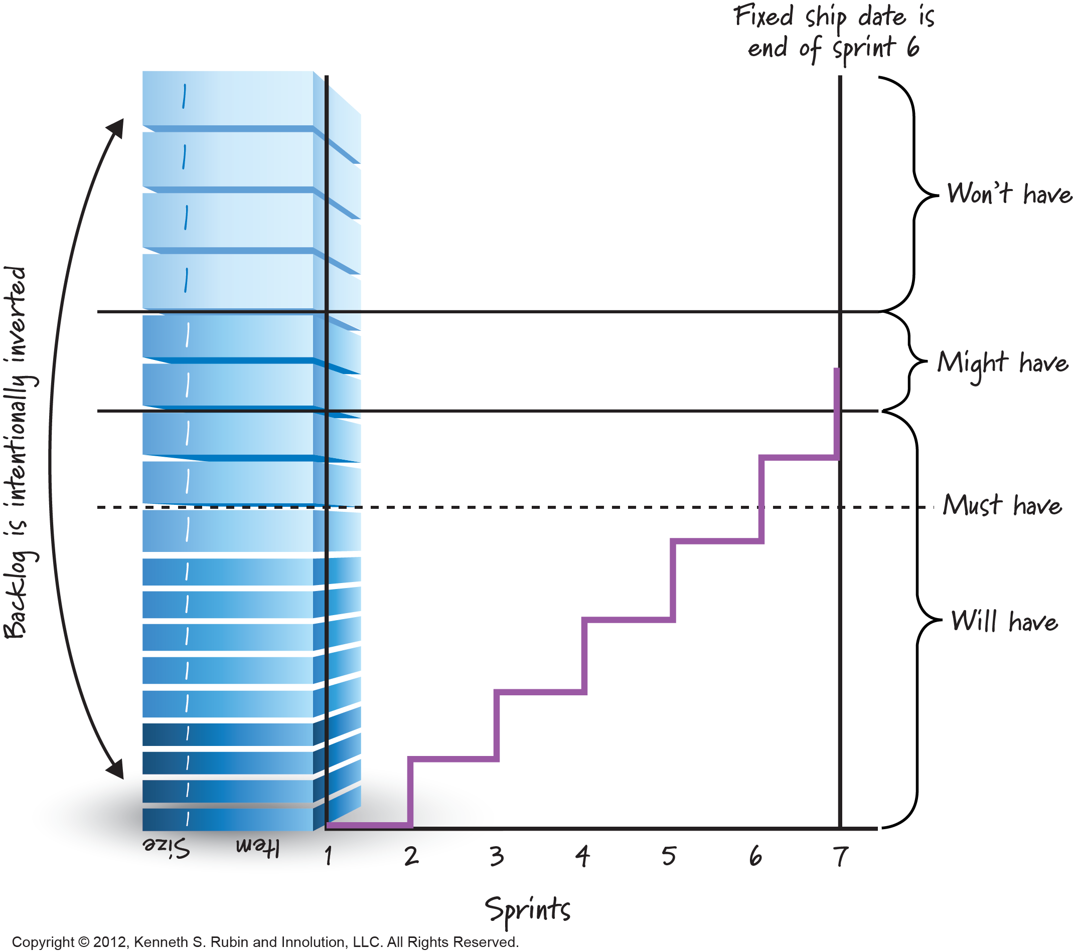
Organizations using a fixed-date release know the number of sprints in the release, so their goal is to communicate the varying range of features they expect to complete and the sprint-to-sprint progress toward the range. For this, some organizations use a modified version of the burnup chart, with an inverted product backlog shown as the vertical axis and the number of sprints as the horizontal axis (see image below). As the sprints progress, the organization can see at a glance which of the must-have PBIs have been delivered, which remain, and where the will have and might have lines are trending based on the team’s actual velocity.
To understand the steps of fixed-date planning, read the blog “Fixed-Date Release Planning in Scrum.” To understand the steps of fixed-scope planning, read the blog post “Fixed-Scope Release Planning in Scrum.”