burndown chart
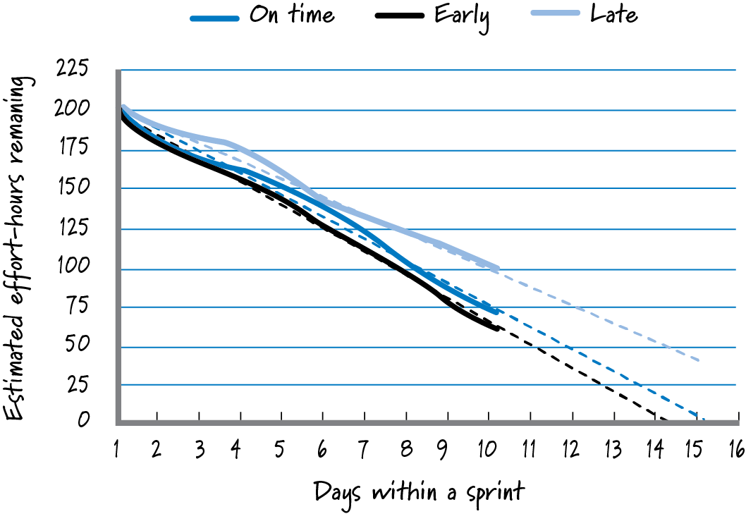
A graph that shows on the vertical axis the quantity of work (in either hours or product backlog item units) remaining over time, which is shown on the horizontal axis. Because less and less work should remain over time, the general trend in the graph is to burn down to a point where no work remains. We can show projected outcomes on burndown charts by calculating a trend line to see when work might be completed. Contrast with burnup chart.